

Image Gallery: Static Image
The Static Image gallery type renders property photos as a composed HTML+CSS layout — without automatic transitions and without a JavaScript Swiper library. Clicking a photo opens a lightbox showing all images. The advantage: fast loading times and calm image behaviour, ideal for high-quality photo presentations.
Activating the gallery type
Section titled “Activating the gallery type”In the backend of your website (wp-admin), navigate to WP-ImmoMakler → Customiser → Image Gallery → Property image presentation and select Static Image.
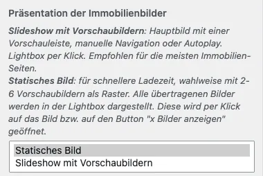
The following options appear in the Image Gallery section.
Image Selection
Section titled “Image Selection”Determines which images of the property appear in the gallery — All images (default), Floor plans only, or Exclude floor plans. This option applies equally to Swiper and Static galleries — see the Image Selection section in the Swiper gallery documentation.
Open Lightbox on Click
Section titled “Open Lightbox on Click”Determines whether clicking a photo in the gallery opens the lightbox over the page. Enabled by default.
When this option is switched off, the images in the gallery are no longer clickable: no lightbox opens, the cursor no longer shows a magnifying glass, and the lightbox script is not loaded at all.
This option applies to both the slideshow and the static gallery.
Clicking a photo in the page builders
Section titled “Clicking a photo in the page builders”In the page builder gallery elements (block editor, Elementor, Divi, WPBakery, Bricks, Enfold), the setting is called Click on a photo and offers a third option per gallery:
- Open full-size view — the default, corresponds to the lightbox being enabled.
- View property — clicking a photo leads to the property’s detail page. Intended for a gallery you place in a property list, for example in Elementor’s Loop Grid, in a Bricks query loop, in a block editor Query Loop, or on a Template Page for the list view. This makes the gallery clickable just like the images in WP-ImmoMakler’s list view. In the static gallery, the main image, the thumbnails, and the “Show all N photos” button all lead to the property alike. For reference properties, the photos remain unlinked as long as the Link detailed view for reference objects setting is switched off.
- Nothing — the photos are not clickable.
Because a click can only trigger one thing, this is a single choice rather than a set of individual switches.
Layout
Section titled “Layout”The layout describes the overall shape of the gallery:
| Layout | Description | Preset used |
|---|---|---|
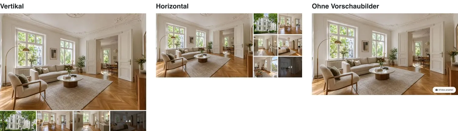
| Vertical (default) | Main image on top, configurable thumbnail grid below (default: one row of four thumbnails; up to 4 rows × 10 columns possible). The gallery is tall/stacked overall. | static_compact |
| Horizontal | Large main image on the left, thumbnail grid alongside on the right (JamesEdition style). Configurable via the additional options below. | static_fullwidth |
| Without thumbnails | Main image only with an “Show all photos” button in the bottom-right corner. | static_hero |
| Grid | No main image: all images appear as equally sized tiles side by side, clicking opens the lightbox at the clicked image. Has its own options, see Grid. | static_grid |
| Mosaic | No main image: blocks of four photos each with two large and two small tiles, mirrored from block to block; clicking opens the lightbox at the clicked image. Has its own options, see Mosaic. | static_mosaic |
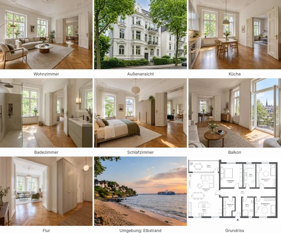
The fourth static layout Grid is available in the Customiser and in the page builders’ gallery elements (Elementor, Bricks, Divi, WPBakery, Enfold, and the block editor) alike: there is no main image, all images appear as equally sized tiles side by side, and clicking opens the lightbox at the clicked image. As soon as you select it, its own options appear while the main image and thumbnail options are hidden:
| Option | Description |
|---|---|
| Columns (maximum) | Maximum number of tiles side by side (1–6). |
| Minimum tile width | A tile never gets narrower than this (100–600 px, default 200 px). Once that many columns no longer fit side by side, one drops automatically – down to a single column on smartphones. The grid goes by the width of its own container, not the screen: in a narrow column of your layout it behaves like a small screen. There is no fixed breakpoint. For floor plans, a higher value (around 280 px) is recommended so the plans stay legible. |
| Tile aspect ratio | The shape of each tile (16:9, 3:2, 4:3, 1:1, golden ratio, 2:1, 3:1). |
| Image fit | Crop fills each tile, cropping the edges as needed – suited to photos. Show in full shows each image in full and leaves edges free – suited to floor plans. |
| Image title as caption | Shows the image’s title from the estate agent software below each tile, e.g. “Ground floor” for floor plans. |
Spacing, corner rounding and the hover animation apply the same as for the other static layouts. Combined with the Floor plans only image selection and the Show in full image fit, the grid matches the WP-ImmoMakler skin’s floor plans box. The grid uses the static_grid preset.
Mosaic
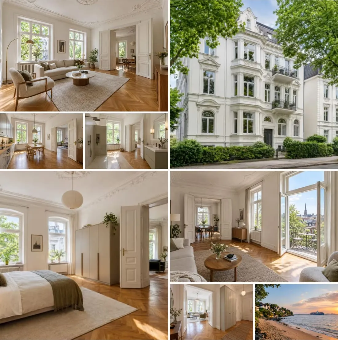
Section titled “Mosaic”The fifth static layout Mosaic is likewise available in the Customiser and in all page builder gallery elements: every four photos form a block of two large and two small tiles. In the first block, the tall tile sits on the right; in the second, on the left; in the third, on the right again – so the pattern doesn’t simply repeat down the page. Clicking opens the lightbox at the clicked image. As soon as you select it, its own options appear while the main image and thumbnail options are hidden:
| Option | Description |
|---|---|
| Block aspect ratio | The shape of a block of four photos (16:9, 3:2, 4:3, 1:1, golden ratio, 2:1, 3:1; default 2:1). |
| Row height distribution | How a block’s height is split between the upper and lower row: 1:1 (both equal height), 2:1 (upper row twice as tall, default), or golden ratio. |
| Limit number of images | Maximum number of photos the mosaic shows: unlimited (default), or 4, 8, 12 or 16 images – always full blocks. For properties with many photos, this prevents a very long page. |
If the last block has fewer than four photos, the existing ones grow to fill the space: a single photo fills the whole block, two share it side by side, and with three, the third takes up the entire lower row on its side. Spacing, corner rounding and hover animation apply the same as for the other static layouts; spacing applies both between the tiles within a block and between blocks. The mosaic uses the static_mosaic preset.
Main image aspect ratio (Horizontal layout)
Section titled “Main image aspect ratio (Horizontal layout)”This option only appears with the Horizontal layout (the large JamesEdition layout with a thumbnail grid on the right).
| Mode | Description |
|---|---|
| Fixed aspect ratio | The main image determines the gallery height via its aspect ratio. The thumbnail grid fills the same height and adjusts its cell sizes automatically. |
| 50/50 split | The main image and the thumbnail grid share the width equally. The aspect ratio field then refers to the entire gallery (main image + thumbnail grid combined). Well suited for very wide Cinemascope or panoramic layouts. |
Aspect ratio (Static)
Section titled “Aspect ratio (Static)”Applies to all layouts that include thumbnails:
- Vertical layout: Aspect ratio of the main image (above the thumbnail row).
- Horizontal + “Fixed aspect ratio”: Aspect ratio of the main image (drives the gallery height).
- Horizontal + “50/50 split”: Aspect ratio of the entire gallery.
Available values:
| Value | Description |
|---|---|
| 16:9 | Widescreen format. |
| 3:2 | Classic photo format (default). |
| 4:3 | Standard format. |
| 1:1 | Square. |
| Golden ratio (1.618:1) | Aesthetically balanced proportion. |
| 2:1 (Cinemascope) | Very wide cinematic format. Particularly striking in 50/50 mode as a hero banner. |
| 3:1 (Panoramic) | Extremely wide panoramic format. |
| Original | In 50/50 mode “Original” falls back to 3:2 (a single CSS box containing a thumbnail grid requires a defined height). |
Thumbnail aspect ratio (Static)
Section titled “Thumbnail aspect ratio (Static)”Only appears with the Vertical layout. Determines the aspect ratio of each individual thumbnail in the row beneath the main image. Default value: 16:9.
Thumbnail rows / columns (Vertical layout)
Section titled “Thumbnail rows / columns (Vertical layout)”Only appear with the Vertical layout. Determine the size of the thumbnail grid directly beneath the main image.
- Rows: 1–4, default 1.
- Columns: 1–10, default 4.
- Total visible thumbnails = rows × columns.
With the default setting of 1 × 4, a narrow row of four thumbnails is visible directly beneath the main image — the long-standing default behaviour. With higher values, a full grid is produced (e.g. 2 × 6 for a dense thumbnail panel).
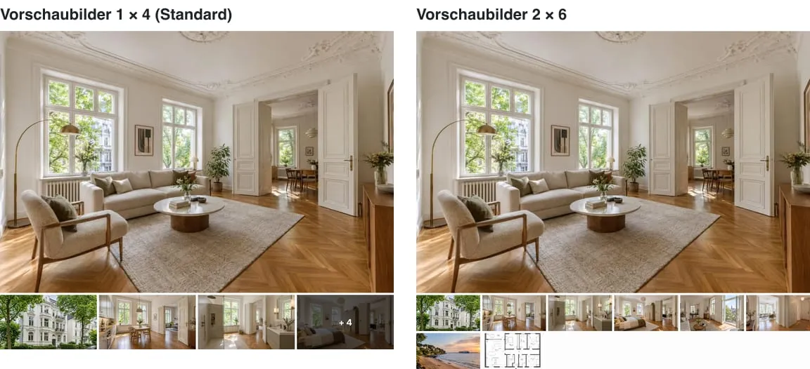
If the property has more photos than the grid can show, the When there are more photos than thumbnail slots option below determines how visitors are directed to the additional images.
Gallery height (Horizontal layout)
Section titled “Gallery height (Horizontal layout)”Only appears with the Horizontal layout.
| Mode | Description |
|---|---|
| Automatic (default) | The gallery height is derived from the chosen aspect ratio (or from the thumbnail grid in 50/50 mode). |
| Fixed height | You specify a fixed height value and unit. |
When Fixed height is selected, two additional fields appear:
- Gallery height (value): Numeric height value. Range: 100–2000.
- Gallery height (unit):
px,vw,vh,svh,lvh,dvh.
See the height unit table in the Swiper gallery documentation for the meaning of each viewport unit.
Thumbnail rows / columns (Horizontal layout)
Section titled “Thumbnail rows / columns (Horizontal layout)”Only appear with the Horizontal layout. They determine the size of the thumbnail grid to the right of the main image.
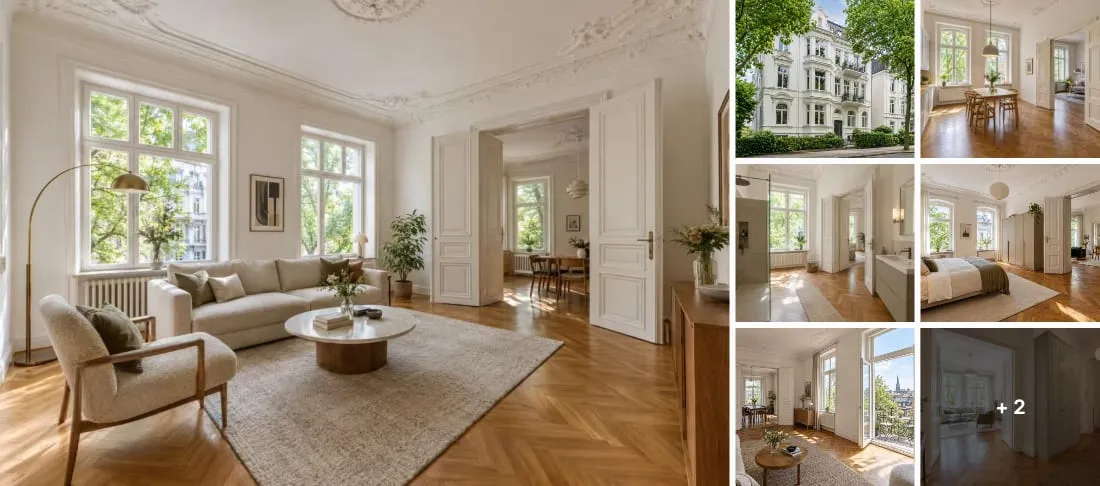
- Rows: 1–4, default 3.
- Columns: 1–4, default 2.
- Total visible thumbnails = rows × columns.
With the default setting of 3 × 2, six thumbnails are visible. If the property has more photos, the option When there are more photos than thumbnail slots (described below) controls how visitors are directed to the additional images.
When there are more photos than thumbnail slots
Section titled “When there are more photos than thumbnail slots”Appears in both layouts that include thumbnails (Vertical and Horizontal). Determines how visitors are pointed to further photos when the thumbnail grid cannot show all of them:
| Option | Description |
|---|---|
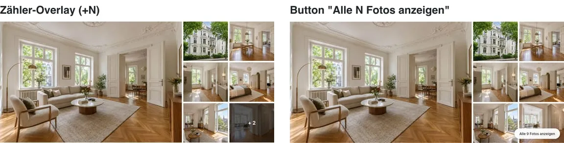
| Counter overlay on the last thumbnail (+N) (default) | The last visible thumbnail is overlaid with a semi-transparent ”+ N” badge, where N is the number of hidden photos. Clicking it opens the lightbox at that exact photo — the visitor first sees what was hidden beneath the overlay. |
| Button below the gallery (Show all N photos) | A standalone pill-shaped button with the text “Show all N photos” appears in the bottom-right corner. Clicking it opens the lightbox at the first photo. |
Controls area for additional actions
Section titled “Controls area for additional actions”The “Show all N photos” pill button is rendered inside a controls area positioned in the bottom-right corner of the gallery (.immomakler-gallery__controls). This area is extensible: other WP-ImmoMakler features or theme builders can insert additional actions here, for example “Show floor plan”, “Video”, or “Virtual tour”, linking to the corresponding sections on the detail page.
Developer note: the PHP filter immomakler_gallery_static_controls_items allows arbitrary action items to be added — see Gallery Library: Customising.
Hover animation
Section titled “Hover animation”Visual feedback when hovering over the main image and thumbnails with the mouse. Three options:
| Option | Description |
|---|---|
| Gentle zoom-in (default) | The image is barely perceptibly enlarged on hover — main image to 100.5%, thumbnails to 100.75%. The effect is intentionally very subtle: the image “breathes” when you hover over it without being distracting. |
| Brighten | On hover, the image is subtly brightened (filter: brightness(1.08)). Again subtle: property photos are often already bright, so highlights should not burn out. |
| None | No animation. Useful for themes with a very calm, photo-album-style aesthetic — or when the detail page already has strong animations elsewhere and the gallery should not add further “life” to the page. |
The transition runs in both directions over 200 ms (linear) — it fades in and out at the same speed. In Slideshow mode, this setting is not applied: the slider animation on image change is the only feedback there; an additional hover effect would feel overwhelming.
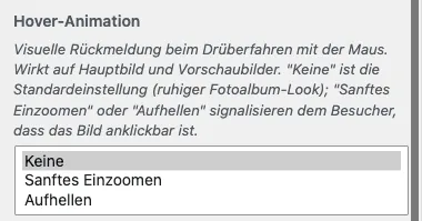
Image spacing, corner rounding
Section titled “Image spacing, corner rounding”These options apply equally to Swiper and Static galleries — see the corresponding sections in the Swiper gallery documentation.
“Display image gallery at full width”
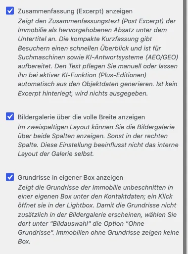
Section titled ““Display image gallery at full width””This option is a page layout setting (not a gallery-internal setting) and is therefore not found under Image Gallery but under WP-ImmoMakler → Customiser → Property detail view → Display image gallery at full width.
It determines whether the gallery spans both columns of the two-column detail view layout, or is displayed only in the right-hand column. It does NOT affect the internal layout of the gallery itself — that is chosen via the Layout (Static) option described above.
For developers
Section titled “For developers”The behaviour can be further customised via filter hooks, CSS variables, and theme builder integrations — see Gallery Library: Customising.
The gallery can also be used outside the detail page via the Gallery Shortcode.