

Key Data Boxes Block
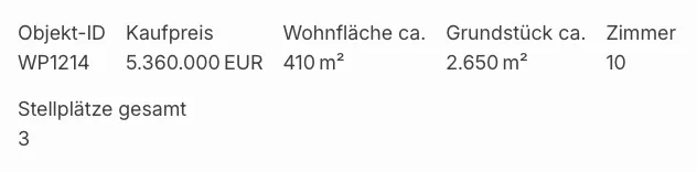
With the Key detail boxes Gutenberg block (immomakler/single-data-boxes) you display the most important data of a property — price, area, number of rooms and more — as boxes. Each box shows a label and the corresponding value, optionally together with an icon. The block matches the functionality and output of the Elementor widget of the same name, “Key detail boxes”, and can be individually configured for each instance.
Requirements
Section titled “Requirements”- WordPress with the Gutenberg editor (WordPress 5.0 or later)
- WP-ImmoMakler (any edition)
Inserting the block
Section titled “Inserting the block”-
Edit a property or open a template
Open an existing property in the editor or a block-based template for the Property post type (requires a block theme or the Site Editor).
-
Insert the block
Click the + icon and search for Key detail boxes, or navigate to the Widgets category. Insert the block.
-
Check the preview
A live preview using the data of an existing sample property is displayed immediately in the editor. On the actual property page, the data of the respective property is shown.
Configuring fields (entries)
Section titled “Configuring fields (entries)”In the block panel Entries (left sidebar, Settings tab) you manage which data fields are displayed as boxes.
Changing the order
Section titled “Changing the order”Use the arrow up and arrow down buttons next to each entry to adjust the display order.
Showing/hiding entries
Section titled “Showing/hiding entries”Click the × symbol of an entry to remove it. Use + Add entry at the end of the list to add new fields.
Configuring an entry
Section titled “Configuring an entry”Click the arrow-down button of an entry to expand its settings:
| Setting | Description |
|---|---|
| Field | The property data field whose value is displayed in the box (e.g. kaufpreis, wohnflaeche). |
| Icon | Icon from the icons for property data of WP-ImmoMakler. Automatic (by field) selects the icon matching the field, for example a calendar for the year of construction or a floor plan for the rooms. You can also pick a specific icon for each field. The default is No Icon: without your selection no icon appears, and existing blocks look unchanged. |
| Override label | Optional text that replaces the automatic field label (e.g. “Price” instead of “Purchase price”). |
| When empty | Controls what happens when the field has no value for the property: Hide box (default) or Show placeholder. |
| Placeholder | Only visible when “Show placeholder” is selected: –, n/a or not specified. |
Layout & display
Section titled “Layout & display”In the block panel Appearance you control how the boxes are arranged:
Display style
Section titled “Display style”| Option | Description |
|---|---|
| Flex (fluid) | Boxes arrange themselves side by side and wrap automatically — suitable for a variable number of boxes. |
| Grid | Boxes are arranged in a fixed grid. With the grid style, the number of columns (1–6) becomes configurable. |
Box layout
Section titled “Box layout”Controls how icon, label and value are arranged within a box. As soon as at least one entry has an icon, the options also name the position of the icon:
| Option | Arrangement |
|---|---|
| Stacked (default) | Icon, label and value stacked. You set the exact order under Order (Stacked). |
| Icon left — label on top, value bottom right | The icon is on the left, label and value sit next to it, one below the other. |
| Icon top-left, value top-right, label below | Icon and value sit side by side, the label below them. |
Order (Stacked)
Section titled “Order (Stacked)”Only for the Stacked box layout: without icons you choose whether the label sits above or below the value. As soon as at least one entry has an icon, all six arrangements of icon, label and value are available:
- Icon → label → value (default)
- Icon → value → label
- Label → icon → value
- Label → value → icon
- Value → icon → label
- Value → label → icon
As soon as at least one entry has an icon, the Icon panel appears in the sidebar. There you set the following for all icons of the block:
| Setting | Description |
|---|---|
| Size (px) | Height and width of the icons, 24 px by default. |
| Color | Colour of the icons. Without a selection the icons take over the text colour of the block. |
In the stacked layout the icon follows the alignment of the label. With Icon stroke width you set a stroke width for this block that differs from the global one; the default is As in the settings. The shape of the icons applies to the whole website, see Icons for property data.
In single-line mode the block shows no icons.
Styling
Section titled “Styling”The appearance of the boxes (colours, spacing, font sizes, etc.) is adjusted via the block toolbar menu and the Design options in the sidebar — just like other WordPress blocks. For further customisation you can write your own CSS rules for the block classes in your theme:
/* Wrapper list */.immomakler-data-list { }
/* Individual box */.immomakler-data-box { }
/* Icon, label, value */.immomakler-data-icon { }.immomakler-data-label { }.immomakler-data-value { }