

Image Gallery: Slideshow with Thumbnails
Since version 5.60, WP-ImmoMakler provides a shared gallery library based on Swiper and Lightgallery. It replaces the previous galleria.io slideshow and offers four layout variants, a unified interaction model on mobile devices, and consistent customisation options via the Customizer.
Activating the Gallery Type
Section titled “Activating the Gallery Type”In your website’s backend (wp-admin), navigate to WP-ImmoMakler → Customizer → Image Gallery → Property Image Presentation and select Slideshow with Thumbnails.
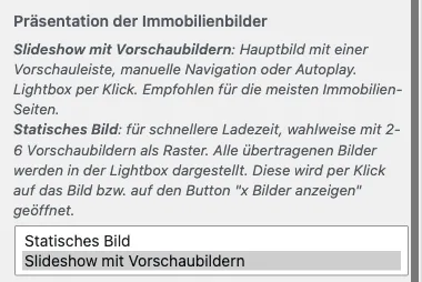
The following options then appear in the Image Gallery section.
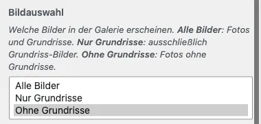
Image Selection
Section titled “Image Selection”Determines which images of the property appear in the gallery. Floor plans are automatically identified as such on import (e.g. via OpenImmo) and can be handled separately here.
| Value | Description |
|---|---|
| All images (default) | Photos and floor plans are displayed together. |
| Floor plans only | Only floor plan images are displayed. |
| Exclude floor plans | Only photos are displayed; floor plans remain hidden. |
This option applies to both the slideshow and the static gallery. It corresponds to the image selection available in the block/theme builder integrations (Gutenberg, Elementor, Divi, WPBakery, Bricks) — allowing you to display, for instance, photos in one place and only the floor plans of a property in another. In the WP-ImmoMakler skin, floor plans can also appear uncropped in a dedicated box directly below the contact box – see Floor plans in a box of their own.
Open Lightbox on Click
Section titled “Open Lightbox on Click”Determines whether clicking a photo in the gallery opens the lightbox over the page. Enabled by default.
When this option is switched off, the images in the gallery are no longer clickable: no lightbox opens, the cursor no longer shows a magnifying glass, and the lightbox script is not loaded at all.
This option applies to both the slideshow and the static gallery.
Clicking a photo in the page builders
Section titled “Clicking a photo in the page builders”In the page builder gallery elements (block editor, Elementor, Divi, WPBakery, Bricks, Enfold), the setting is called Click on a photo and offers a third option per gallery:
- Open full-size view — the default, corresponds to the lightbox being enabled.
- View property — clicking a photo leads to the property’s detail page. Intended for a gallery you place in a property list, for example in Elementor’s Loop Grid, in a Bricks query loop, in a block editor Query Loop, or on a Template Page for the list view. This makes the gallery clickable just like the images in WP-ImmoMakler’s list view. The arrows and the thumbnail strip remain reserved for image navigation — only a click on the main image switches to the property. For reference properties, the photos remain unlinked as long as the Link detailed view for reference objects setting is switched off.
- Nothing — the photos are not clickable.
Because a click can only trigger one thing, this is a single choice rather than a set of individual switches.
Layout
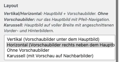
Section titled “Layout”The Layout option determines the basic arrangement of the gallery. The name describes the form of the gallery as a whole, not the position of the thumbnail strip:
| Layout | Description |
|---|---|
| Vertical | Main image on top, thumbnail strip below (default). The gallery is tall/stacked overall — works naturally in narrow columns and below the header. |
| Horizontal | Main image on the left, thumbnail strip on the right. The gallery is wide overall — suits hero areas and full-width desktop templates. |
| Without Thumbnails | Only the main image with arrow navigation. Suitable when the gallery is placed below a narrow column or within a listing. |
| Carousel | Main image at full width with clipped predecessor and successor images (peek effect). Uses a fixed height instead of an aspect ratio. |
Arrow Buttons on the Thumbnail Strip
Section titled “Arrow Buttons on the Thumbnail Strip”Activates additional arrow buttons for scrolling through the thumbnail strip: top/bottom for the horizontal layout, left/right for the vertical layout. Useful when the thumbnail strip contains more images than are visible at once.
Auto-Advance Images (Autoplay)
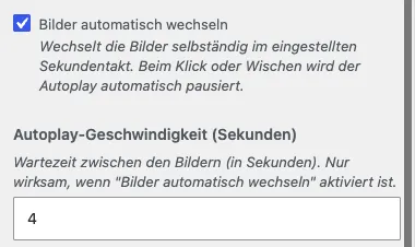
Section titled “Auto-Advance Images (Autoplay)”When enabled, images advance automatically at the configured interval. Clicking or swiping pauses autoplay.
- Autoplay Speed (seconds): Interval between image advances. Default 4 seconds, range 1–30.
Transition Effect
Section titled “Transition Effect”Determines how the main image animates when changing.
| Value | Description |
|---|---|
| Slide | The main image slides horizontally to the next image (default). Classic slider effect. |
| Fade | The image dissolves directly into the next one, without the background showing through in between. Creates a calmer impression and suits galleries where the focus should be on the images themselves rather than the slider mechanics. |
| “Aus- und Einblenden” | The image fades out completely, then the next one fades in. In between, the gallery’s background is briefly visible — a clear cut between images. |
Transition Duration (milliseconds)
Section titled “Transition Duration (milliseconds)”How quickly the transition between images occurs. Default value: 400 ms, range 100–2000 ms.
- Smaller values (100–200 ms) feel very immediate — suitable for fast, energetic slideshows.
- Larger values (≥ 800 ms) feel softer and calmer — suitable in combination with autoplay and/or the fade effect.
This setting applies both to image changes and to the thumbnail strip scrolling when clicking a thumbnail — both animate at the same speed, so no “jump + lag” effect occurs.
Main Image Aspect Ratio / Thumbnail Aspect Ratio
Section titled “Main Image Aspect Ratio / Thumbnail Aspect Ratio”Controls the aspect ratio of the respective image areas.
| Value | Description |
|---|---|
| 16:9 | Widescreen — standard for slideshows and hero images. |
| 3:2 | Classic photo format. |
| 4:3 | Standard format. |
| 1:1 | Square. |
| Golden Ratio (1.618:1) | Naturally balanced, aesthetically pleasing proportion. |
| Original | Uses the natural aspect ratio of each photo. Images are not cropped — photos with different proportions retain their individual form. |
In the Carousel layout, the main image aspect ratio acts as the width of each image at a fixed height — with “Original”, different photos will have different widths.
Thumbnail Strip Height (px)
Section titled “Thumbnail Strip Height (px)”Displayed when the vertical layout (thumbnails below the main image) is selected. Default: 110 px.
Determines the height of the horizontal thumbnail strip. The width of each individual thumbnail is calculated automatically from height × aspect ratio; the number of simultaneously visible thumbnails is calculated from the gallery width divided by the thumbnail width.
Thumbnail Strip Width (px)
Section titled “Thumbnail Strip Width (px)”Displayed when the horizontal layout (thumbnails to the right of the main image) is selected. Default: 200 px.
Determines the width of the vertical thumbnail strip. The height of each individual thumbnail is calculated automatically from width ÷ aspect ratio; the number of simultaneously visible thumbnails is calculated from the gallery height divided by the thumbnail height.
Show Thumbnails on Mobile Devices
Section titled “Show Thumbnails on Mobile Devices”By default, thumbnails are hidden on narrow screens (≤ 768 px) — they are usually too small to be useful there. Enable this option to show thumbnails on mobile devices as well.
Carousel Height / Height Unit
Section titled “Carousel Height / Height Unit”Both options only apply in the Carousel layout.
- Carousel Height sets the numeric height value (default: 400).
- Height Unit determines how the value is interpreted:
| Unit | Description |
|---|---|
px | Fixed pixel height (default). |
vw | Percentage of the viewport width. Scales with the browser width. |
vh | Percentage of the viewport height. Scales with the browser height. |
svh | Small viewport height (mobile): includes the address bar in the calculation. |
lvh | Large viewport height (mobile): excludes the address bar. |
dvh | Dynamic viewport height (mobile): switches between svh and lvh depending on whether the address bar is visible. |
Gap Between Images (px)
Section titled “Gap Between Images (px)”Determines the spacing between the main image and the thumbnail strip, as well as between individual thumbnails. Default value: 6 px.
Corner Rounding
Section titled “Corner Rounding”The Corner Rounding (px) and Apply Rounding to options apply equally to Swiper and Static galleries.
- Corner Rounding (px): 0 (sharp corners, default) to 30 px.
- Apply Rounding to:
- Each image individually: Main and thumbnail images each receive rounded corners.
- Only the outer corners of the gallery: Only the four outer corners of the entire gallery are rounded; individual images retain sharp corners.
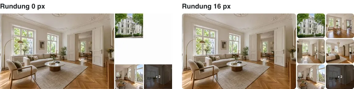
Image Resolution and srcset
Section titled “Image Resolution and srcset”The Swiper gallery uses wp_get_attachment_image() and therefore automatically provides a complete srcset with all registered image sizes. The browser selects the appropriate variant based on the display position and the device’s pixel density (e.g. 2× on Retina displays). For this reason, there is no “pixel dimensions” entry in the Customizer for the Swiper gallery — manually selecting a size would have no effect on the file actually loaded by the browser.
The determining factor for image quality is the original resolution of the uploaded photos. If these are sufficiently high, WordPress automatically serves the appropriate size for each device class.
Keyboard Navigation
Section titled “Keyboard Navigation”Visitors can also navigate through the gallery using the arrow keys (as well as Page Up / Page Down) as soon as the gallery is within the visible area of the page. When the lightbox is open, the arrow keys control only the lightbox — the gallery behind it remains unaffected. The thumbnails and the image sliders in the list view do not respond to the arrow keys, so that a single keypress does not move several sliders at once.
Keyboard navigation is always active. It can be switched off via a filter hook — see Gallery Library: Customising.
For Developers
Section titled “For Developers”The behaviour can be further customised via filter hooks and CSS variables — see Gallery Library: Customising.
The gallery can also be used outside the detail page via the Gallery Shortcode.