

Photo Gallery "Grid" Block
The Gutenberg block Photo Gallery “Grid” (immomakler/gallery-grid) showed a property’s images in blocks of four photos with an alternating arrangement. This layout is now available as the Mosaic static layout in the Property Gallery block – with the same options, plus a lightbox, hover animation and corner rounding. The Photo Gallery “Grid” block is therefore no longer offered in the block inserter.
Converting the block
Section titled “Converting the block”-
Select the block
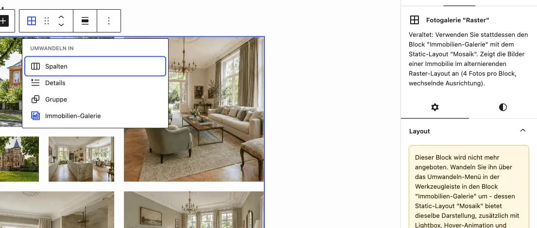
In your website’s backend (wp-admin), open the page or template containing the block and click the Photo Gallery “Grid” block. A note in the Layout side panel points to the conversion.
-
Convert
Click the block icon (left) in the block’s toolbar and select Property Gallery. The block is replaced; the Static presentation and Mosaic layout are already selected.
-
Save
Update the page. The frontend display stays the same, and clicking a photo now opens the lightbox.
What happens to your settings
Section titled “What happens to your settings”| Photo Gallery “Grid” | Property Gallery (Mosaic) |
|---|---|
| Block aspect ratio | Block (Mosaic) under Aspect ratios, same value |
| Row height distribution | Row height distribution, same value |
| Spacing in px (0–50) | Spacing, same value |
| Spacing in em, rem, vw or vh, or above 50 px | The Property Gallery only supports pixel values up to 50 px; spacing resets to the default after conversion and can be set again |
| Limit number of images | Limit number of images, same value |
| Image filter | Image selection, same value |
The Mosaic layout’s own options are described under Image Gallery: Static Image.
You might also be interested in
Section titled “You might also be interested in”- Gallery — Image gallery as slideshow or static layout, including Mosaic
- Create Single Page — Complete detail view as a block template
- Image gallery: Static image
- Image gallery: Slideshow with thumbnails